Pandas Style API
Mon 13 May 2019
Pandas_UI เครื่องมือจัดการ Pandas DataFrame แบบง่าย ๆ – Pandas ep.7


Introduction
I have been working on a side project so I have not had as much time to blog. Hopefully I will be able to share more about that project soon.
ใน ep ที่แล้ว เราใช้ Pandas Profiling ในการช่วยทำการสำรวจข้อมูล Exploratory Data Analysis (EDA) แต่ถ้าเราต้องการเปลี่ยนแปลงข้อมูลนิด ๆ หน่อย ๆ หรือเราต้องการพล็อตกราฟที่ใน Pandas Profiling ไม่มีมาให้ล่ะ จะทำอย่างไร เราสามารถใช้ Pandas_UI มาช่วยได้
In the meantime, I wanted to write an article about styling output in pandas. The API for styling is somewhat new and has been under very active development. It contains a useful set of tools for styling the output of your pandas DataFrames and Series. In my own usage, I tend to only use a small subset of the available options but I always seem to forget the details. This article will show examples of how to format numbers in a pandas DataFrame and use some of the more advanced pandas styling visualization options to improve your ability to analyze data with pandas.
Pandas_UI คืออะไร
What is styling and why care?

The basic idea behind styling is that a user will want to modify the way the data is presented but still preserve the underlying format for further manipulation.
Pandas_UI คือ เครื่องมือหน้าจอ User Interface Tools ที่ช่วยอำนวยความสะดวกให้เราสามารถจัดการ และแก้ไขข้อมูลใน Pandas DataFrame ได้อย่างรวดเร็ว และง่ายดาย
The most straightforward styling example is using a currency symbol when working with currency values. For instance, if your data contains the value 25.00, you do not immediately know if the value is in dollars, pounds, euros or some other currency. If the number is $25 then the meaning is clear.
เราสามารถเลือก Row, Column, เงื่อนไข และ Operation ที่ต้องการใน Pandas_UI จะช่วย Generate Code ภาษา Python ให้เรา โดยที่เราไม่ต้องจำชื่อฟังก์ชัน ชื่อพารามิเตอร์ต่าง ๆ
Percentages are another useful example where formatting the output makes it simpler to understand the underlying analysis. For instance, which is quicker to understand: .05 or 5%? Using the percentage sign makes it very clear how to interpret the data.
Pandas_UI ถูกสร้างด้วยเทคโนโลยีที่เราคุ้นเคย เช่น NumPy, plotly, ipywidgets, pandas_profiling, qgrid โดยสร้างเป็น Jupyter Notebook Extension ทำให้สามารถรันใน Jupyter Notebook ได้เลย
The key item to keep in mind is that styling presents the data so a human can read it but keeps the data in the same pandas data type so you can perform your normal pandas math, date or string functions.
เรามาเริ่มกันเลยดีกว่า
Pandas styling also includes more advanced tools to add colors or other visual elements to the output. The pandas documentation has some really good examples but it may be a bit overwhelming if you are just getting started. The rest of this article will go through examples of using styling to improve the readability of your final analysis.
ด้วย Code เพียงแค่ 3 บรรทัด
Styling the data
Let’s get started by looking at some data. For this example we will use some 2018 sales data for a fictitious organization. We will pretend to be an analyst looking for high level sales trends for 2018. All of the data and example notebook are on github. PLease note that the styling does not seem to render properly in github but if you choose to download the notebooks it should look fine.
![]() Check it out on github Last updated: 02/07/2020 11:16:12
Check it out on github Last updated: 02/07/2020 11:16:12
Import the necessary libraries and read in the data:
ใน ep ที่แล้ว เราใช้ Pandas Profiling ในการช่วยทำการสำรวจข้อมูล Exploratory Data Analysis (EDA) แต่ถ้าเราต้องการเปลี่ยนแปลงข้อมูลนิด ๆ หน่อย ๆ หรือเราต้องการพล็อตกราฟที่ใน Pandas Profiling ไม่มีมาให้ล่ะ จะทำอย่างไร เราสามารถใช้ Pandas_UI มาช่วยได้
Pandas_UI คืออะไร
The data includes sales transaction lines that look like this:
Pandas_UI คือ เครื่องมือหน้าจอ User Interface Tools ที่ช่วยให้เราสามารถจัดการ และแก้ไขข้อมูล Pandas DataFrame ได้อย่างสะดวก และรวดเร็ว
account number
name
sku
quantity
unit price
ext price
date
0
740150
Barton LLC
B1-20000
39
86.69
3380.91
2018-01-01 07:21:51
1
714466
Trantow-Barrows
S2-77896
-1
63.16
-63.16
2018-01-01 10:00:47
2
218895
Kulas Inc
B1-69924
23
90.70
2086.10
2018-01-01 13:24:58
3
307599
Kassulke, Ondricka and Metz
S1-65481
41
21.05
863.05
2018-01-01 15:05:22
4
412290
Jerde-Hilpert
S2-34077
6
83.21
499.26
2018-01-01 23:26:55
เราสามารถเลือก Row, Column, เงื่อนไข และ Operation ที่ต้องการใน Pandas_UI จะช่วย Generate Code ภาษา Python ให้เรา โดยที่เราไม่ต้องจำชื่อฟังก์ชัน ชื่อพารามิเตอร์ต่าง ๆ
Given this data, we can do a quick summary to see how much the customers have purchased from us and what their average purchase amount looks like:
Pandas_UI ถูกสร้างด้วยเทคโนโลยีที่เราคุ้นเคย เช่น NumPy, plotly, ipywidgets, pandas_profiling, qgrid โดยสร้างเป็น Jupyter Notebook Extension ทำให้สามารถรันใน Jupyter Notebook ได้เลย
0. Install
mean
sum
name
Barton LLC
1334.615854
109438.50
Cronin, Oberbrunner and Spencer
1339.321642
89734.55
Frami, Hills and Schmidt
1438.466528
103569.59
Fritsch, Russel and Anderson
1385.366790
112214.71
Halvorson, Crona and Champlin
1206.971724
70004.36
ติดตั้ง Library pandas_ui และ Enable Jupyter Notebook Extension ให้เรียบร้อยIn [1]:
For the sake of simplicity, I am only showing the top 5 items and will continue to truncate the data through the article to keep it short.
As you look at this data, it gets a bit challenging to understand the scale of the numbers because you have 6 decimal points and somewhat large numbers. Also, it is not immediately clear if this is in dollars or some other currency. We can fix that using the DataFrame style.format .
In [2]:
Here is what it looks like now:
1. Import

Import Library ที่เราติดตั้งไว้ด้านบนIn [3]:
Using the format function, we can use all the power of python’s string formatting tools on the data. In this case, we use ${0:,.2f} to place a leading dollar sign, add commas and round the result to 2 decimal places.
For example, if we want to round to 0 decimal places, we can change the format to ${0:,.0f}
2. Data
ในเคสนี้เราจะใช้ Dataset ที่เป็นข้อมูลแบบ Tabular จาก Adult DatasetIn [4]:

If you are like me and always forget how to do this, I found the Python String Format Cookbook to be a good quick reference. String formatting is one of those syntax elements that I always forget so I’m hoping this article will help others too.
ลอง ls ดูว่ามีไฟล์อะไรบ้างIn [5]:
Now that we have done some basic styling, let’s expand this analysis to show off some more styling skills.
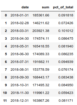
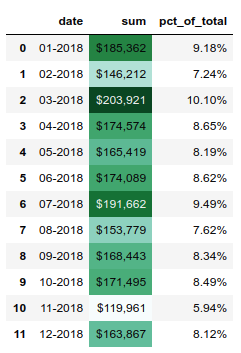
If we want to look at total sales by each month, we can use the grouper to summarize by month and also calculate how much each month is as a percentage of the total annual sales.
Out[5]:
3. Explore Data
We know how to style our numbers but now we have a combination of dates, percentages and currency. Fortunately we can use a dictionary to define a unique formatting string for each column. This is really handy and powerful.
สั่งเปิดไฟล์ CSV ได้เลย
In [6]:

I think that is pretty cool. When developing final output reports, having this type of flexibility is pretty useful. Astute readers may have noticed that we don’t show the index in this example. The hide_index function suppresses the display of the index - which is useful in many cases.
In [9]:
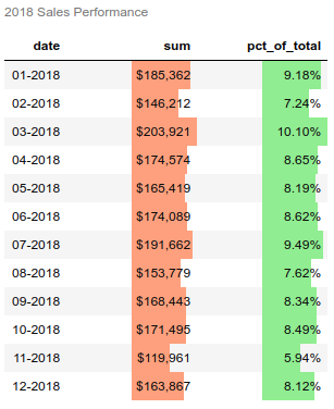
In addition to styling numbers, we can also style the cells in the DataFrame. Let’s highlight the highest number in green and the lowest number in color Trinidad (#cd4f39).
ตัวอย่างหน้าจอการใช้งาน

หน้าจอหลัก
One item to highlight is that I am using method chaining to string together multiple function calls at one time. This is a very powerful approach for analyzing data and one I encourage you to use as you get further in your pandas proficiency. I recommend Tom Augspurger’s post to learn much more about this topic.
Another useful function is the background_gradient which can highlight the range of values in a column.
ลบ Row ที่เลือกไว้

ประวัติการแก้ไข เราสามารถนำโค้ด Python ที่ Generate มาให้ไปใช้ต่อได้เลย
The above example illustrates the use of the subset parameter to apply functions to only a single column of data. In addition, the cmap argument allows us to choose a color palette for the gradient. The matplotlib documentation lists all the available options.

Styling with Bars
แก้ไขข้อมูลใน DataFrame โดยตรง
The pandas styling function also supports drawing bar charts within the columns.

Here’s how to do it:
มีฟังก์ชัน Pandas Profiling Report ในตัว


This example introduces the bar function and some of the parameters to configure the way it is displayed in the table. Finally, this includes the use of the set_caption to add a simple caption to the top of the table.
เลือก 1 Column มาพล็อต Histogram เราสามารถนำโค้ด ภาษา Python ที่ Generate มาให้ไปใช้ต่อได้เลย
The next example is not using pandas styling but I think it is such a cool example that I wanted to include it. This specific example is from Peter Baumgartner and uses the sparkline module to embed a tiny chart in the summary DataFrame.

Here’s the sparkline function:
รองรับกราฟ 3 มิติ

We can then call this function like a standard aggregation function:
ตัวอย่างหน้าจอพล็อตกราฟ 3 มิติ Scatter 3D เราไม่ต้องจำชื่อ Parameter

quantity
ext price
mean
sparkline
mean
sparkline
name
Barton LLC
24.890244
▄▄▃▂▃▆▄█▁▄
1334.615854
█▄▃▆▄▄▁▁▁▁
Cronin, Oberbrunner and Spencer
24.970149
█▄▁▄▄▇▅▁▄▄
1339.321642
█▅▅▃▃▃▂▂▁▁
Frami, Hills and Schmidt
26.430556
▄▄▁▂▇█▂▂▅▅
1438.466528
█▅▄▇▅▃▄▁▁▁
Fritsch, Russel and Anderson
26.074074
▁▄▇▃▂▂█▃▄▄
1385.366790
▇█▃▄▂▂▁▂▁▁
Halvorson, Crona and Champlin
22.137931
▇▆▆▇█▁▄▂▄▃
1206.971724
██▆▅▁▃▂▂▂▂
หน้าจอสร้างคำสั่ง Update ข้อมูลทีละเยอะ ๆ ตามเงื่อนไขที่กำหนด
I think this is a really useful function that can be used to concisely summarize data. The other interesting component is that this is all just text, you can see the underlying bars as lines in the raw HTML. It’s kind of wild.

Conclusion
Credit
The pandas style API is a welcome addition to the pandas library. It is really useful when you get towards the end of your data analysis and need to present the results to others. There are a few tricky components to string formatting so hopefully the items highlighted here are useful to you. There are other useful functions in this library but sometimes the documentation can be a bit dense so I am hopeful this article will get your started and you can use the official documentation as you dive deeper into the topic.
Finally, thanks to Alexas_Fotos for the nice title image.
หมายเหตุ
Reference : https://pbpython.com/styling-pandas.html
Library นี้ใหม่มาก ยังมี Bug อยู่หลายจุด
ถ้าเกิด Error ให้รัน Cell ใหม่
ขณะนี้ยังไม่รองรับ Google Colab
แชร์ให้เพื่อน:
FacebookTwitterEmailLinkedInLineShare
บทความที่เกี่ยวข้อง:
Reference : https://www.bualabs.com/archives/4299/pandas_ui-pandas-dataframe-user-interface-tools-pandas-ep-7/#more-4299
Last updated