# Algorithmic Trading
## **Data Science for Algorithmic Trading**
In this article I plan to give you a glimpse into an asset model for algorithmic trading. This model of the world should allow us to make predictions about what will happen, based upon what happened in the past, and to make money by trading on this information. The model and trading stradegy are a toy example, but I am providing the data science part of the code, so that you can get a real sense of the tangibility of this modelling work.
I started writing the code for this article a few months ago, and I’m posting it now along with the news that [we got our SEC license for Investifai](https://adviserinfo.sec.gov/Firm/297838)!
Since my [Investifai.com](http://investifai.com/) presentation at TMLS in September 2018, I have been getting questions about what our proprietary data is, and frankly, I’m not talking. It is important to point out that with only “standard” market data from Bloomberg and Thompson Reuters, you are up against the whole FinTech world, who pays for access to the same data. And so, novel data sources give you an edge in making predictions for which other market participants may not have the data.
In this article I’m going to show you how to identify economic data and match it up with a [tradeable](https://www.quora.com/What-is-the-correct-spelling-tradable-or-tradeable) asset. We will get the data, clean it, interrogate it, and set it up in a simple model.
> “All models are wrong but some are useful” -George Box
Our asset for this toy exercise is the **currency pair USD/CAD**. We can obtain the daily historical data for the asset going back to the 1950s from Open Data Canada [right here](https://open.canada.ca/data/en/dataset/1bc25b1e-0e02-4a5e-afd7-7b96d6728aac).
The following code cleans up that data, transforming it into a useable format.
Here is the data for USD/CAD in a chart from fxtop.com:

And now here is the data we extracted from the Open Data Canada dataset:The exchange rate for trading one USD into CAD excluding fees.

The data dips in the same places on both charts, and with a few more spot checks, we are confident that this is the data we think it is.
So far, we have seen that there is quite a bit of sneaky cleaning up to do in order to get data in a nice format. This is the story in data science: Most of the work is on manipulating the data into the format you need for observing correlations and then making predictions.
Now we move on to get some data we think will help us to predict the movement of the USD/CAD asset. That data will also come from Open Data Canada, in the form of the [Industrial Product Price Index (IPPI)](https://open.canada.ca/data/en/dataset/39a39c7c-24f1-4789-8f20-a04bcbf635b0) which should be related to how the Canadian currency fares relative to the US currency. If stuff costs more, maybe that tells us something about the economy and the currency (relative to the US). There is a lot more info I’ll skip on [where this data comes from](http://www23.statcan.gc.ca/imdb/p2SV.pl?Function=getSurvey\&SDDS=2318) and how it is collected and calculated. Now hold onto your seat. Here we go…The full dataset (left) looks right. Taking a closer look at one decade (right) also looks reasonable. We see that not all signals start or end at the same points in time.


The two figures above are our initial dive into the economic data for our model. We know from the data guide that this IPPI index pegs “ Index, 2010=100” and we can see that peg clearly in the long term data (left) from the 1950s to 2019. Everything converges on 2010=100 and then expands back out from there.
There is also some small amount of weirdness for specific signals in the data. The following figure shows the normalized graph for the IPPI factor called ‘Paper office supplies’ from 2008 to 2016. Most signals dont have this problem, but it’s important to keep in mind that the dataset is not perfect.Normalized graph for the IPPI factor called ‘Paper office supplies’ from 2008 to 2016

Using this dataset has some serious limitations. First of all, it is only available monthly. That’s too slow for a real trading algorithm. Second, the factors in this index is all stuff about Canada, which is one half of the story or less when it comes to the USD/CAD trade. Third, we are not including data from the news, or other data sources. All this is fine, because we are just showing how it works in principle. In reality, there are lots of ways to leverage monthly macro data in daily trading, and to merge inputs from lots of types of data into a model. With these caveats in mind, here is how we extracted the IPPI data into a usable format for our model:
A machine learning model has some input observations “x” and some output predictions “y” where the model is a function that makes the connection y=f(x). The model “f” maps from the observations to the predictions. In our case “x” is the IPPI data, and we want to use it to predict price changes in USD\_CAD, which is our “y” output. Before we can make predictions, we should dig into the correlations between IPPI and USD\_CAD to validate that these things are actually related to each other as we hypothesized. We will also look beyond correlations to see what correlations we see in future values of USD\_CAD based upon past values in the IPPI data. Put another way, we will look for indications that there are signals in IPPI that we can use to make predictions about USD\_CAD.
Let’s begin by joining the economic data with the asset data to observe some cool stuff. The code for all of the following data science is found here:
### A “big picture” look at the data: 1950s to now
After the preprocessing, 931 factors remain in the dataset. Let’s first have a look at the factors that correlate strongly with USD\_CAD over the full duration of the data (1950s to now).

In this first chart we see a bunch of interesting correlations. For example, timber and related refined products like newsprint and pulp an paper are correlated with USD strength. That makes sense. Expensive paper from Canada leads to less demand, and famously Canada and the US have a never ending [dispute over softwood lumber pricing](https://en.wikipedia.org/wiki/Canada%E2%80%93United_States_softwood_lumber_dispute). This tells us that cheap lumber from Canada puts pressure on USD\_CAD.
Next, let’s look at what factors correlate with a weaker USD\_CAD. We can see in the chart below that the oil and gas sector plays a large role, as does the ore and mining sector. This makes sense. Canada produces ore (e.g. nickel in Sudbury) and also exports oil (e.g Alberta’s bitumen), and so it stands to reason that a rise in their prices correlates with a fall in the USD\_CAD.

Here is a zoomed-out view of each IPPI factor and its correlation with USD\_CAD:

These are some nice correlations, but correlation is not the same thing as a trading prediction. We need to make money using **causality**, not **correlation**. And so we need some sort of **expected returns** data based on our [correlation observations](https://www.investopedia.com/ask/answers/030515/how-correlation-used-modern-portfolio-theory.asp).
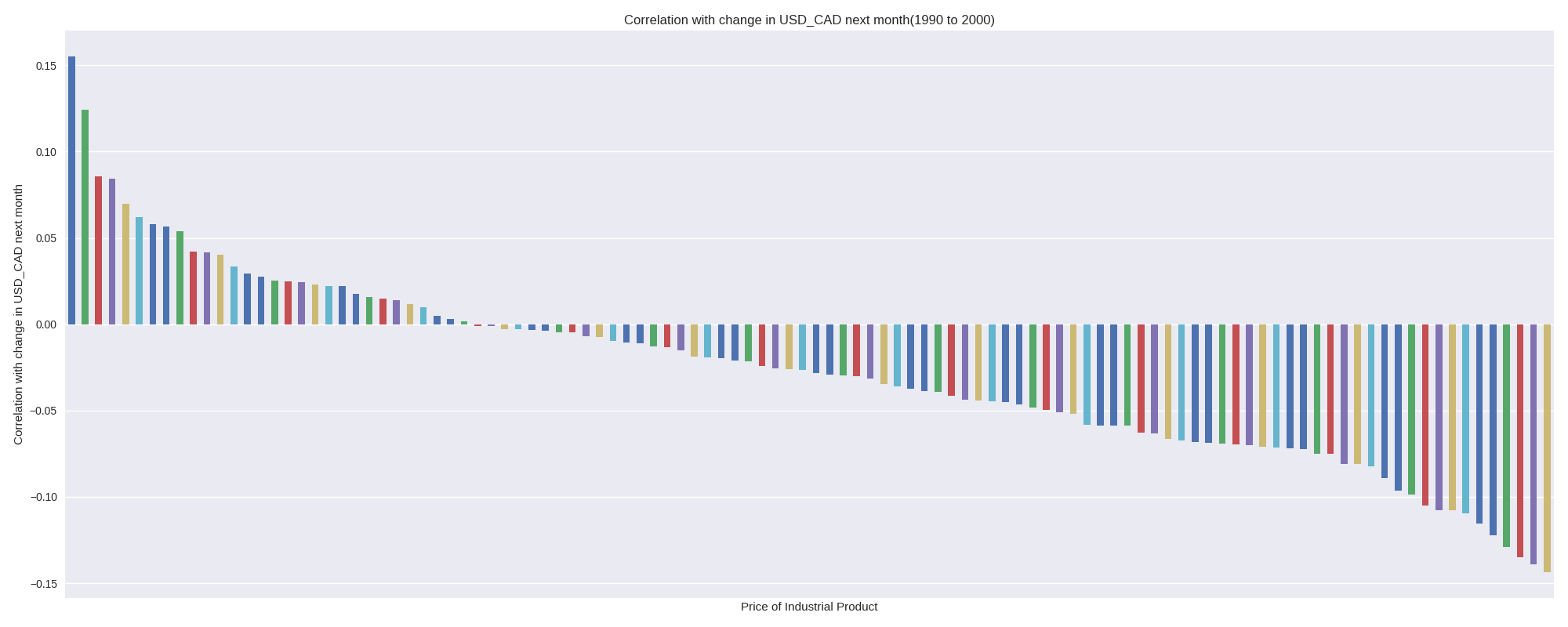
The following figure shows the correlation between IPPI factors, and USD\_CAD change in value over the following month. One caveat is that the survey data may not be available, even a month later, but let’s pretend that we can get this timely data access.any factors correlate with future changes in USD\_CAD

The long term overall USD\_CAD relationship with the Industrial Product Price Index is not the same as a per-decade relationship. It’s a good idea for us to go deeper into the data to help us understand what the shifting relationship is between IPPI factors and USD\_CAD moves. In the next sections of this article we will look at these data on a per-decade basis for the 1990s, 2000s, and 2010s.
### The 1990s — A Bull Run For USD\_CAD
Let’s first examine stuff in the 90s that most strongly correlated with USD strength. We see some usual suspects like cars, and paper products (as mentioned above, higher prices are bad for CAD). It’s interesting to see IPPI near the top of the list, indicating that generally higher industrial product prices in Canada meant a stronger USD.

The USD kicked ass during this time period, and so most everything rising in price correlated with US dominance. Here is the price chart from above squeezed to see only the 1990s:

As we see in the chart below, only a few IPPI factors in the 1990s negatively correlated with USD\_CAD. Wood pulp is a strange one to see with a negative correlation, because most other wood-related factors ended up with positive correlations.

For consistency, let’s look at the correlation chart for this time period.

As before, we care more about trading signals than raw correlations, and so the following chart shows how each IPPI factor correlated with the change from the current month’s USD\_CAD to following month’s USD\_CAD (the chnge in the rate).
Notice that although most factors positively correlated with USD\_CAD, not many were positively correlated with the change is USD\_CAD. Also, notice that lots of correlations for stuff where there was no data in the 1990s are hidden from the results. In the previous section looking at all the data, any factor that had data anywhere could be correlated. Now that we are looking at a smaller subset of the data, we can only say stuff about the factors for which there was data in the 1990s.
Here is a quick glimpse at what the dataframe looks like, to show that many factors are not available early on in the dataset:

Let’s now move on to look at the data that will underpin our model using the lens of the 2000s.
### The 2000s — A Changing World
Let’s step back and look at the top positive and negative correlations in the data as we did for the 1990s and for the full dataset.
In the 2000s we continued to see a strong correlation between USD\_CAD strength and car stuff, as well as lumber/paper related stuff.

We see in the negative correlations below that metals and oil are still part of the USD\_CAD weakness story.

So what changed? The change is subtle from this zoomed-in view, but basically the 1990s upswing in USD\_CAD didn’t last. Here is the zoomed-out view of the correlations between IPPI factors and USD\_CAD, with the 1990s on the right and the 2000s on the left.


We see a pretty dramatic reversal from factors correlating with USD\_CAD, to factors negatively correlating with USD\_CAD. This shows us that using these factors from the 1950s to now as the training data for our predictive model would be a mistake. Using all the data would ignore the [regime changes in how these factors apply](https://www.nber.org/papers/w17182) in real life. We can, however, backtest with a sliding window that learns from new stuff and dumps out old stuff. That is a pretty common tactic for testing strategies “far” into the past.
And now, for consistency, let’s look at the chart showing how various factors correlate with USD\_CAD changes after a month.

It’s a pretty even situation, with plenty of positive and negative correlations showing up in the data. This is a good sign for trying to predict USD\_CAD movement during this period. In truth, the direction of the correlations is not as critical as the strength, and how independent the signals are from each other. Ultimately the key factor is how much money we make. The idea here is to hold CAD and USD, and switch between them monthly according to when our model predicts we should.
### The 2010s — The longest economic expansion ever
I was curious to see what the story is with high correlation signals in the data. What does the correlation look like? Well, have a look at snowmobile prices and USD\_CAD in the chart below\.Super high correlation between USD\_CAD and snowmobile prices at the factory gate. You can see it just by looking at it.

This correlation between snowmobile prices at the factory gate, and the strength of the USD is a really Canadian story. The more it costs to buy snowmobiles, the less power a Canadian dollar has in the USA. Interesting. It is likely some other underlying causal factor like oil and metal prices that creates this dynamic, but it was still good to have a look inside some of the data to verify that it makes sense.

It turns out that there were some very strong correlations in the 2010s between some IPPI factors and USD\_CAD. We continue to see car stuff like SUVs, and also war stuff playing a big role in USD strength. I think there is an underlying message about 2001's September 11th attack and the resulting wars boosting the USD both as a safe haven and as a military power. I think that had an overhang into the 2010s. These correlations pushed the lumber story out of the top results. Although the dispute is still not resolved, many [pulp and paper mills in Canada simply shut down](https://www.theglobeandmail.com/report-on-business/economy/paper-trail-the-fall-of-forestry/article21967746/) in the 2010s.
We see in the chart below that oil and related products as well as metals continued to be a part of the negative correlations for USD\_CAD.

During the 2010s there were a lot more factors available in the dataset. The following chart shows the distribution of USD\_CAD correlations among these factors.
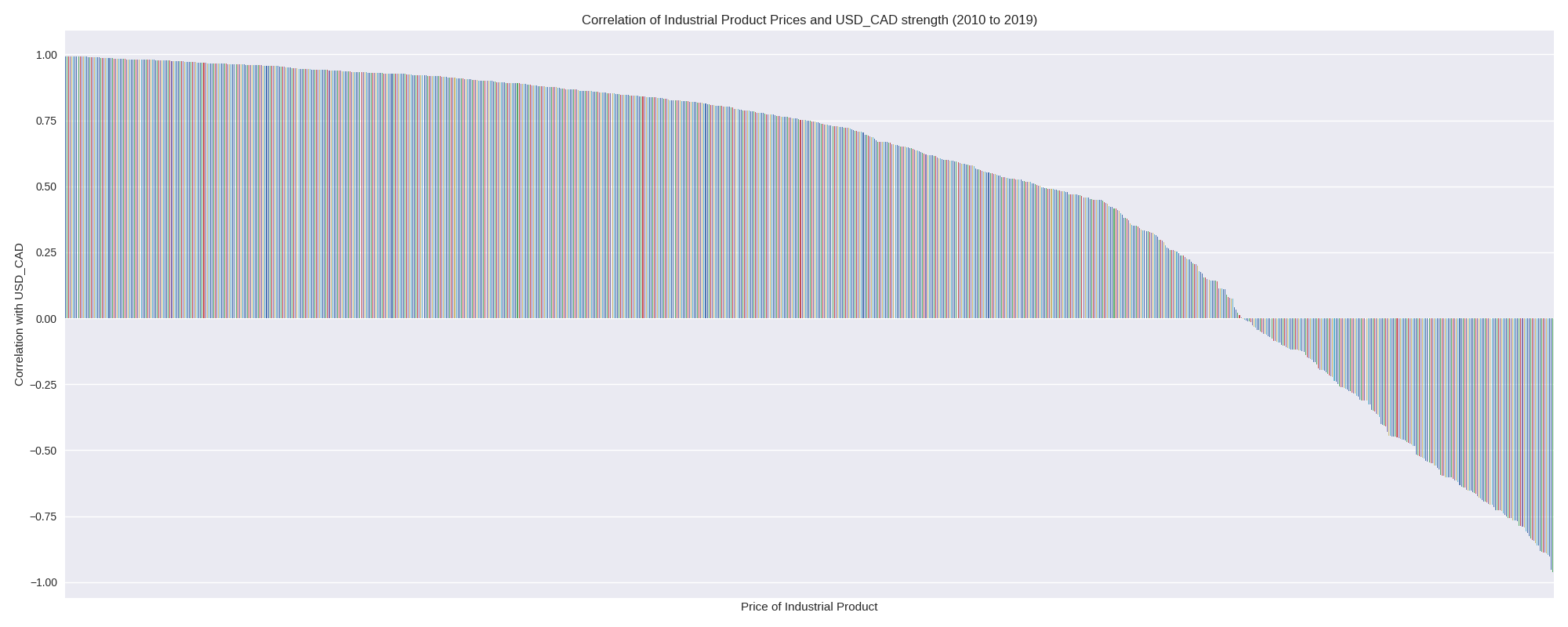
Now let’s have a look at how these many factors can be used to make predictions.

Unlike the 1990s, there appears to be a correspondence between the correlation and prediction distributions. Keep in mind that the order of the factors in these charts is not the same, and so this data does not tell us if factors that correlate with USD\_CAD also predict changes in USD\_CAD.
### A quick summary, and on to model generation
We saw that the overall dataset has more stuff from this decade than in past decades, and that data from decades ago is probably not relevant to us today. There are some key points in time where the underlying story in the data changes, and we can’t use data from before that time to make predictions about the period following it.Correlations between the economic data and asset data vary depending on the time period observed and the signals available during the time period in question. Bottom left is for the 1990s. Top left is for the 2010s. Top right is for the 1990s. Bottom right is for the full dataset.


We also saw that the data is rational with respect to our expectations about the world. A model based on this data should be relatively interpretable. For example, if a few factors point to a USD\_CAD rise, we should be able to see what those factors are, and validate that this long or short position makes sense.
At this point I want to refer back to my article on [**lots of things that you should not do**](https://towardsdatascience.com/silly-stock-trading-on-onepanel-io-gpus-51cde1772bd1) when setting up a trading strategy. Keep this stuff in mind as we proceed to build a model. This is a *toy example*, and you now have the code for how to replicate the data science behind this work, including the dataset. I encourage you to play around with it and see what you can come up with.
## Predictive Algorithmic Trading Model
To make our predictive model, we need to set up the [tensors](https://www.tensorflow.org/guide/tensors) “x” and “y” as we discussed above. The input “x” will be a further cleaned up version of the IPPI data, and our “y” will be one of 2 categories: LONG, and SHORT. Fancier things like a threshold to decide how much predicted change in USD\_CAD justifies an action is beyond the scope of this toy example. I chose a feed forward deep learning model (a DNN) shaped like an autoencoder, with some noise added at the input to help avoid overfitting.
To make the predictions, we look back at the last 3 months of scaled IPPI indicators.
And so:
To make predictions, we only use the indicators that had at least a 10% correlation with the expected return from USD\_CAD. This reduces the number of dimensions in “x”. Furthermore, during testing, we use the trained scaler from the training run, because we would not have known in advance how to scale stuff that didn’t happen yet. Let’s set fees at 0.20 basis points per trade ([as listed in IB](https://www.interactivebrokers.com/en/index.php?f=1590\&p=fx)). Each model run is a brand new training and testing instance for the model (from scratch).
Let’s train on the data from 2000 to the start of 2012, and then “trade” in backtesting from 2012 to the close of Q1 2017. That’s 12 years of monthly training data, or 12\*12=144 training datapoints. In fact, after slicing off a NaN, we get 143 training samples, each with 39 data points. When there is this dearth of data samples, I like to think of them as sets of equations for which we are identifying an approximate solution. It won’t be perfect, but we will know if it worked when we see the model make us money.**Before Tuning:** Model performance for 10 simulation runs before tuning the network and massaging the training data. Results are pretty random.**After some effort, but before fees:** Model performance for 10 simulation runs. These simulations did not include fees. Results look promising.**A trading algorithm is born:** These are the results with fees included. We make a bit less money, but have a bit more consistent performance. Fees are only paid when we buy in or change position. All 9 of 10 simulations eventually ended in profit.
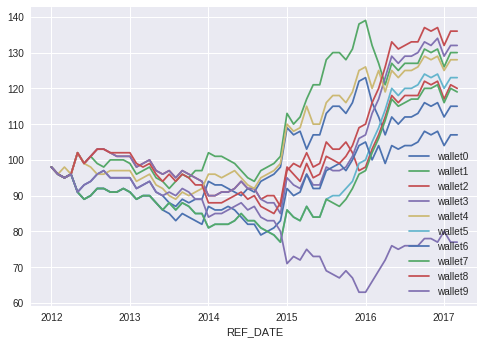
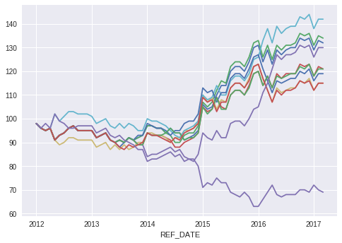

At the point where I stopped messing around (see above), the model had developed consistency between runs. However, during the first 3 years of the simulation, all of the models lost money. That’s a problem, and I’m just going to leave it as-is, because this is a toy problem. The average final value across the simulations was 118.7 between 2012–01–01 and 2017–03–01. That amounts to 5.25 years of trading. The annualized return rate was therefore 3.32%. Not that great, but not 0 or negative. I’m not going to get into how we can grow the return with leverage, or an analysis of the risk adjusted return. The training accuracy was consistently in the 80% range, while the test accuracy was mostly above 50% as reported in the following table.
We can see that the training accuracy was not a good hint that the last model (#9) was not a good model. The smartest approach to maximize profits here is to stack the models together and average out this type of error. Imagine putting $10 into the hands of 10 models instead of $100 into the hands of just one model instance.
Going long for the full simulation period yields the following:Buy and hold USD\_CAD for the duration of the testing period.

Overlaying these active and passive strategies, we get the following chart.

We see that holding USD\_CAD would have been great. Unfortunately, we would not know in advance that it is profitable to buy and hold USD\_CAD without the advice of some model telling us what to do. Unlike in the equity markets, where a real long term strategy is to buy and hold, currency pairs don’t follow this logic. Instead, the fiat currency pairs shift around with the rise and fall of the related economies and governments.
**What factors caused a prediction? (**[**Shown using nice tools**](https://towardsdatascience.com/interpretability-of-deep-learning-models-9f52e54d72ab)**)**
It’s cool that we have a model that makes money, but it would be great to get a better sense of what it does. I used DeepSHAP to get that picture. First, I set a prior (background) expectation using 75 samples from x\_train. The rest of x\_train was used for getting the SHAP values used in the next step. The following chart shows the summary plot for the x\_test data using the SHAP values obtained in the last step.The relative contribution of each of the factors in our little model. Each factor is preceded by an m1 if it is from the month before the prediction, or m2 if it is from 2 months before the prediction.

We can see right away that this model is not doing what we thought it was. It cares the most about men’s suits (textiles), poultry, cleaning products, tobaco and cosmetics. These are all factors we didn’t think too much about in all of the above analysis. Good thing we looked. Now, taking a step back, we see that oil-based stuff like asphalt and jet fuel are in here, which is a good sign we are not totally out to lunch. And we see the paper-related stuff as well, like newsprint, which is a good sign that the stuff we expected to see is still in there. What we learned from this analysis is that the stuff you think is important may not end up being the most important factors. In this case it turned out that the stuff we were thinking about is in the list, but has less of an impact on predictions than other factors in the model.
Finally, there are some more limitations of the approach presented in this article worth mentioning. It is better to use a data warehouse than this manual approach, and it is better to use a backtesting framework as well. I tried to keep this article as self-contained as possible, without reference to any proprietary code.
## Where to from here?
[Investifai.com](http://investifai.com/) finally has SEC, and so we can now take on assets! The office in Dubai is bustling with excitement as we put the finishing touches on the user interface and KYC process. **If you are a qualified investor and looking to invest in the initial fund, please contact** [**hello@investifai.com**](mailto:hello@investifai.com)
Here in Canada, our internal audit product [AuditMap.ai](http://auditmap.ai/) continues to mature as we go through client onboarding. [More on that stuff here](https://towardsdatascience.com/better-internal-audits-with-artificial-intelligence-53b6a2ec7878).
If you liked this article on data science in algorithmic trading model development, then have a look at some of my most read past articles, like “[How to Price an AI Project](https://medium.com/towards-data-science/how-to-price-an-ai-project-f7270cb630a4)” and “[How to Hire an AI Consultant](https://medium.com/towards-data-science/why-hire-an-ai-consultant-50e155e17b39).”
Reference :