# Loading Animation
## How to Use Pure CSS to Create a Beautiful Loading Animation for your App

If you've been around the internet lately, you've most likely seen a nice subtle loading animation that fills page content before gracefully loading in.
Some of the social giants like Facebook even use this approach to give page loading a better experience. How can we do that with just some simple CSS?
* [What are we going to build?](https://www.freecodecamp.org/news/how-to-use-css-to-create-a-beautiful-loading-animation-for-your-app/#what-are-we-going-to-build)
* [Just want the snippet?](https://www.freecodecamp.org/news/how-to-use-css-to-create-a-beautiful-loading-animation-for-your-app/#just-want-the-snippet)
* [Part 1: Creating our loading animation](https://www.freecodecamp.org/news/how-to-use-css-to-create-a-beautiful-loading-animation-for-your-app/#part-1-creating-our-loading-animation)
* [Part 2: Using our loading animation in a dynamic app](https://www.freecodecamp.org/news/how-to-use-css-to-create-a-beautiful-loading-animation-for-your-app/#part-2-using-our-loading-animation-in-a-dynamic-app)
### What are we going to build?
We're going to create a loading animation using a CSS class that you can apply to pretty much any element you want (within reason).

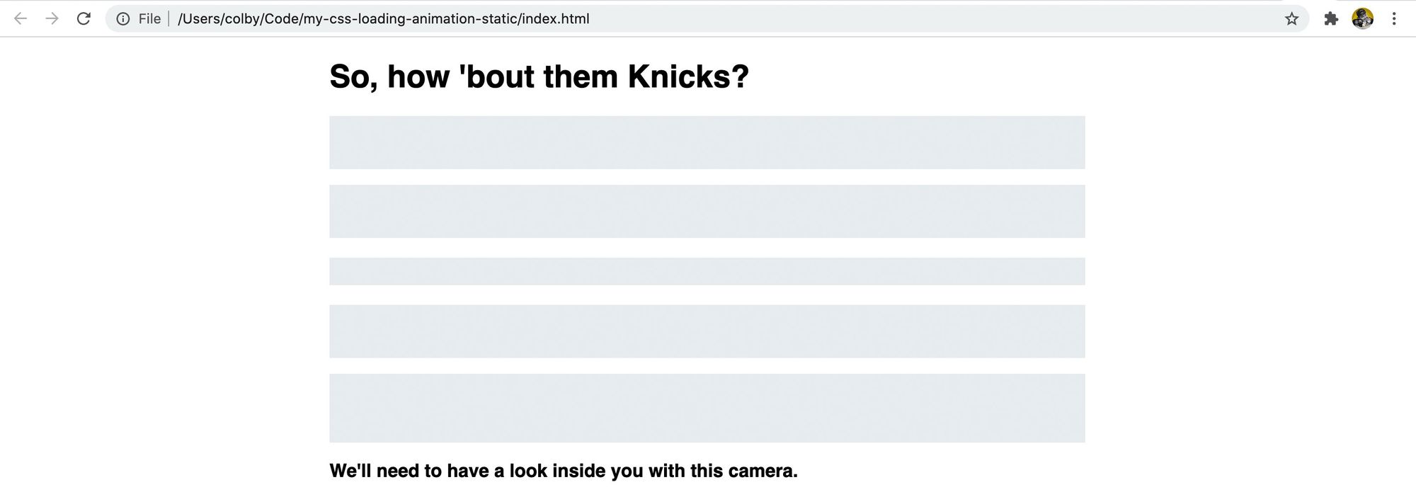
Loading animation preview
This gives you great flexibility to use it and makes the solution nice and simple with only CSS.
While the snippet is pretty small and you could just copy and paste it, I'll walk you through what's happening and an example of using it dynamically when loading data.
### Just want the snippet?
You can grab it here!
CSS Loading Animation
CSS Loading Animation. GitHub Gist: instantly share code, notes, and snippets.
262588213843476Gist

### Do I need to know how to animate before this tutorial?
No! We'll walk through in detail exactly what you need to do. In fact, the animation in this tutorial is relatively simple, so let's dig in!
### Part 1: Creating our loading animation
This first part is going to focus on getting the loading animation together and seeing it on a static HTML website. The goal is to walk through actually creating the snippet. We'll only use HTML and CSS for this part.
#### Step 1: Creating some sample content
To get started, we'll want a little sample content. There's really no restrictions here, you can create this with basic HTML and CSS or you can add this to your Create React App!
For the walk through, I'm going to use HTML and CSS with a few examples of content that will allow us to see this in effect.
To get started, create a new HTML file. Inside that HTML file, fill it with some content that will give us the ability to play with our animation. I'm going to use [fillerama](http://fillerama.io/) which uses lines from my favorite TV show [Futurama](https://en.wikipedia.org/wiki/Futurama)!

Static HTML & CSS webpage with content from fillerama.io
If you're going to follow along with me, here's what my project looks like:
```
my-css-loading-animation-static
- index.html
- main.css
```
[Follow along with the commit!](https://github.com/colbyfayock/my-css-loading-animation-static/commit/9aa7925f7048fa1b73fef74d0d56380c29fc5d73)
#### Step 2: Starting with a foundation loading class
For our foundation, let's create a new CSS class. Inside our CSS file, let's add:
```css
.loading {
background: #eceff1;
}
```
With that class, let's add it to a few or all of our elements. I added it to a few paragraphs, headings, and lists.
```markup
For example...
```

Static HTML & CSS webpage with a gray background for the content
That gives us a basic background, but we'd probably want to hide that text. When it's loading, we won't have that text yet, so most likely we would want to use filler text or a fixed height. Either way, we can set the color to transparent:
```css
.loading {
color: transparent;
background: #eceff1;
}
```

Static HTML & CSS webpage with a gray background and transparent color for the content
If you notice with list elements, whether you apply the class to the top level list element (`
` or ``) vs the list item itself (`- `), it looks like one big block. If we add a little margin to the bottom of all list elements, we can see a different in how they display:
```css
li {
margin-bottom: .5em;
}
```

Style difference between applying to the top level list or the list items
And now it's starting to come together, but it kind of just looks like placeholders. So let's animate this to look like it's actually loading.
[Follow along with the commit!](https://github.com/colbyfayock/my-css-loading-animation-static/commit/f68cdef36be11311a5cc11a1d39e52ea7e7bb48d)
#### Step 3: Styling and animating our loading class
Before actually animating our class, we need something to animate, so let's add a gradient to our `.loading` class:
```css
.loading {
color: transparent;
background: linear-gradient(100deg, #eceff1 30%, #f6f7f8 50%, #eceff1 70%);
}
```
This is saying that we want a [linear gradient](https://developer.mozilla.org/en-US/docs/Web/CSS/linear-gradient) that's tilted at 100 degrees, where we start with `#eceff1` and fade to `#f6f7f8` at 30% and back to `#eceff1` at 70%;

Subtle gradient background that might look like a glare
It's hard to see initially when it's still, it might just look like a glare on your computer! If you'd like to see it before moving on, feel free to play with the colors above to see the gradient.
Now that we have something to animate, we'll first need to create a [keyframes](https://developer.mozilla.org/en-US/docs/Web/CSS/@keyframes) rule:
```css
@keyframes loading {
0% {
background-position: 100% 50%;
}
100% {
background-position: 0 50%;
}
}
```
This rule when applied will change the background position from starting at 100% of the x-axis to 0% of the x-axis.
With the rule, we can add our [animation](https://developer.mozilla.org/en-US/docs/Web/CSS/CSS_Animations/Using_CSS_animations) property to our `.loading` class:
```css
.loading {
color: transparent;
background: linear-gradient(100deg, #eceff1 30%, #f6f7f8 50%, #eceff1 70%);
animation: loading 1.2s ease-in-out infinite;
}
```
Our animation line is setting the keyframe to `loading`, telling it to last for 1.2 seconds, setting the [timing function](https://developer.mozilla.org/en-US/docs/Web/CSS/animation-timing-function) to `ease-in-out` to make it smooth, and tell it to loop forever with `infinite`.

No change – it's not animating
If you notice though after saving that, it's still not doing anything. The reason for this is we're setting our gradient from one end of the DOM element to the other, so there's nowhere to move!
So let's try also setting a `background-size` on our `.loading` class.
```css
.loading {
color: transparent;
background: linear-gradient(100deg, #eceff1 30%, #f6f7f8 50%, #eceff1 70%);
background-size: 400%;
animation: loading 1.2s ease-in-out infinite;
}
```
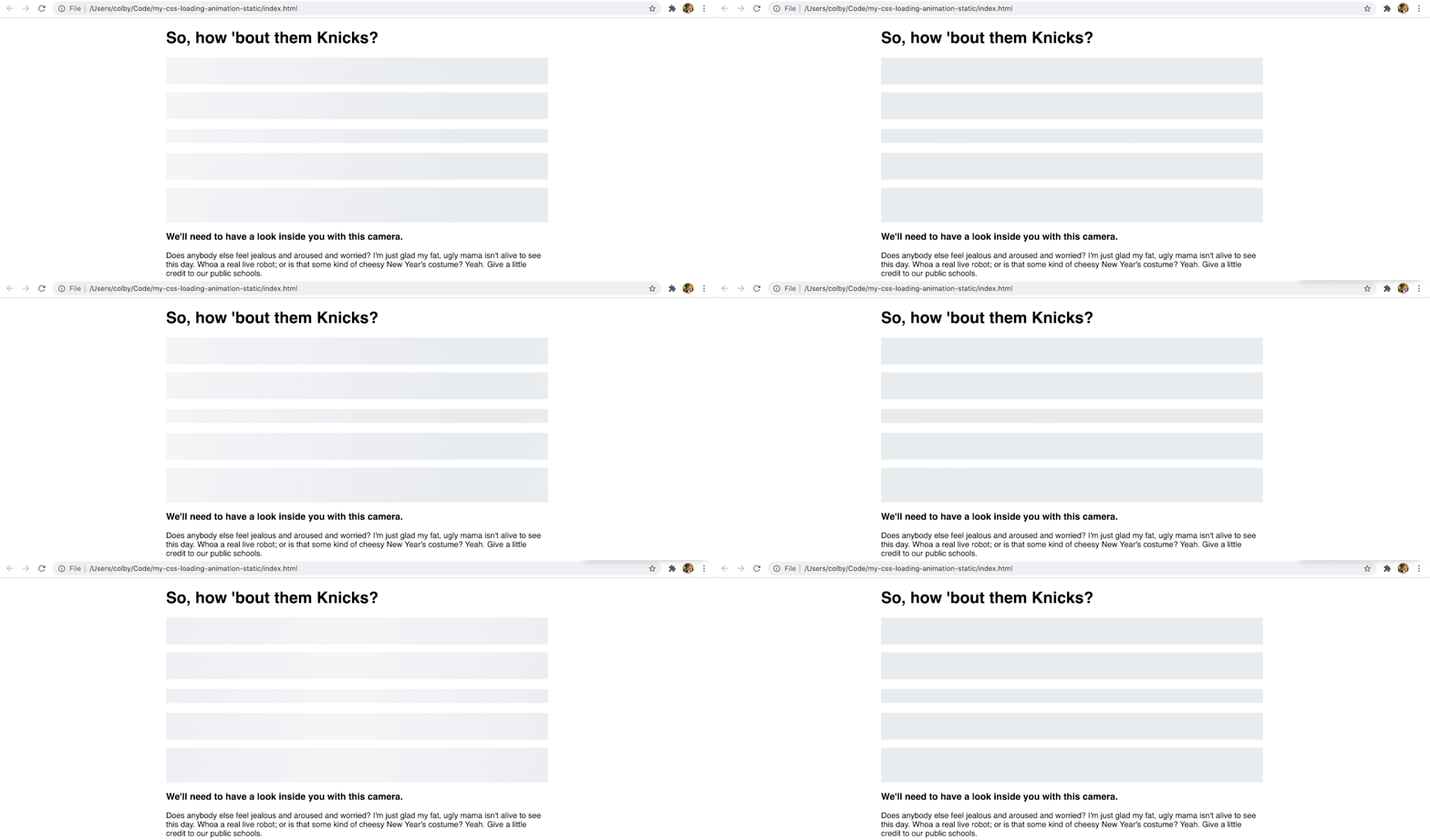
Now, since our background expands beyond our DOM element (you can't see that part), it has some space to animate with and we get our animation!

Our loading animation!
[Follow along with the commit!](https://github.com/colbyfayock/my-css-loading-animation-static/commit/bc4b5ec955a0906fea032edbbaf90f037f76c91b)
### Part 2: Using our loading animation in a dynamic app
Now that we have our loading animation, let's put it into action with a basic example where we fake a loading state.
The trick with actually using this is typically we don't have the actual content available, so in most cases, we have to fake it.
To show you how we can do this, we're going to build a simple [React](https://reactjs.org/) app with [Next.js](https://nextjs.org/).
#### Step 1: Creating an example React app with Next.js
Navigate to the directory you want to create your new project in and run:
```
yarn create next-app
# or
npm init next-app
```
It will prompt you with some options, particularly a name which will determine the directory the project is created in and the type of project. I'm using `my-css-loading-animation-dynamic` and the "Default Starter App".

Creating a new project with Next.js
Once installed, navigate into your new directory and start up your development server:
```
cd [directory]
yarn dev
# or
npm run dev
```

Starting development server with Next.js
Next, let's replace the content in our `pages/index.js` file. I'm going to derive the content from the previous example, but we'll create it similar to how we might expect it to come from an API. First, let's add our content as an object above our return statement:
```javascript
const content = {
header: `So, how 'bout them Knicks?`,
intro: `What are their names? I'm Santa Claus! This opera's as lousy as it is brilliant! Your lyrics lack subtlety. You can't just have your characters announce how they feel. That makes me feel angry! Good news, everyone! I've taught the toaster to feel love!`,
list: [
`Yes! In your face, Gandhi!`,
`So I really am important? How I feel when I'm drunk is correct?`,
`Who are those horrible orange men?`
]
}
```
To display that content, inside ``, let's replace the content with:
```jsx
{ content.header }
{ content.intro }
{ content.list.map((item, i) => {
return (
- { item }
)
})}
```
And for the styles, you can copy and paste everything from our Part 1 `main.css` file into the `